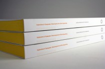
If you ask any graphic design student at San Francisco’s Academy of Art University to name his/her most-faved teachers, Typography 2 instructor Carolina de Bartolo will no doubt pop up in the mix. In fact, it was with her students’ encouragement (and…
Tag: san francisco graphic design
San Francisco Chronicle: John Patrick McKenzie exhibit / They Are Full of Holy Nonsense
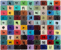
“Sexy people are apple pies.” “One, two, tin …” “Acne, pimp, jerk…” The unlikely grouping and categorizing of words, phrases and numbers in the new exhibition “They Are Full of Holy Nonsense” at SF’s Creativity Explored range from the whimsical to…
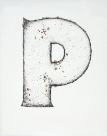
Print Magazine: The Letter Collector
What is it about hand-made letters that utterly rocks our world? Are we just so bored with reading and seeing everything digitally nowadays? Or is it because working with type is such a huge component to our jobs as designers…
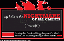
HowDesign Magazine: The Nightmare Client—YOU (or rather…me!)
Look in the mirror and say hello to the nightmare of all clients—Yourself. Why is it so hard for graphic designers to design for ourselves? In my latest article for HOW Magazine, I offer tips for taming the fire-breathing client within…
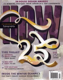
HowDesign Magazine: Feature Article!
The February 2010 issue of HOW magazine is currently on newstands and in bookstores across the country. The article I wrote, “Turn Downtime into Playtime” features the awesome work by design firms Flywheel Design, Brand Engine, and graphic designer France Liddell….
