From drab cubicles and cardboard curtains to game rooms and concert stages, startup offices runs the gamut from bare-bones to over-the-top-perks. But if the look doesn’t jibe with your company’s brand, you may be missing out on a valuable opportunity…
Tag: graphic design
Entrepreneur Magazine: Refinery29 Gets A Branding Makeover
Everyone can use a makeover now and again – even a super stylish site like Refinery29. For the November issue of Entrepreneur Magazine, I talk all things design with Refinery29 founder Justin Stefano along with the brand wizards at Wolff Olins…
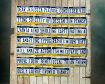
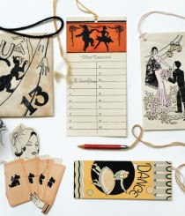
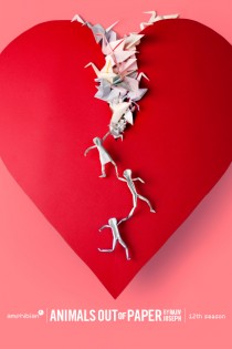
Print Magazine Article: License Plates Turned Into Coolest Design Invitation
How do you know when you’ve officially “made it” as a designer? Forget winning prestigious design awards, having your work featured in coveted magazines, or even scoring the biggest clients. We’re talking license plates, baby! In a wild attempt to woo designer/typographer Jessica…
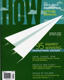
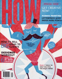
HOW Magazine Article: Designing to Your Own Beat
If aliens from outer space came to Earth seeking to understand graphic design culture, they would no doubt discover an overabundance of well-worn earphones and speakers next to some very cool, creative work. In fact, from design studios to home…
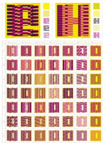
Print Mag Article: Deep Surface: A New Exhibition Celebrating Ornament and Pattern Design
Ornament and pattern design – love it or hate it, the style debate rages on. Whether you dig decorative flourishes or vote anti-adornment on all things design, one thing is clear – the fanciful aesthetic has developed a bad rep. Name-called everything…
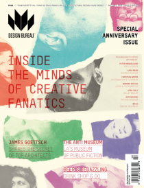
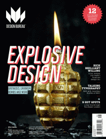
Design Bureau article: 5 Designers / 5 Questions
In the September/October 2011 issue of Design Bureau Magazine, I continue my 5 Designers/ 5 Questions column tapping the creative minds of the judging panel for Chicago’s Archive11 student typography event. Interviewing the industry’s coolest designers–Stefan Bucher, James Goggin, Robert Petrick, Paul…
HOW Magazine Article: The Rhythm of Design
Album art and CD packaging may be a dying breed (thanks to the rise of MP3s), but awesome music-inspired design projects are coming through the speakers loud and clear. In the September 2011 creativity column for HOW Magazine, I speak with…
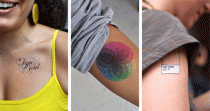
T Magazine Article: Tattly’s Designer Tattoos
Have you ever had the desire to get the word “mother” tattooed on your forearm, but were more concerned about it being properly kerned in Helvetica than about how it would make your mother totally freak? Tattly, a new e-shop, features…
T Magazine Article: Athletic Typography | Running Alphabet
The Spanish graphic designer Joan Pons Moll is creating a new typeface, but unlike most typographers, he’s doing so with his feet rather than a computer, and he’s slightly out of breath. Taking sneakers to pavement, Pons is planning to run…
Print Magazine Article: Jennifer Sterling is Back!
Thankfully, graphic designers are a bit too nerdy for the paparazzi. But had the snooping press hounds any clue into the talent’s of our industry’s rockstar creatives – Jennifer Sterling surely would have been one of their buzz-worthy targets when she…
Design Bureau Magazine: 5 Designers, 5 Questions
If you’re not familiar with Design Bureau Magazine, get to know them ASAP. Their fresh, edgy editorial spanning all fields of design from graphic to interior to fashion is deliriously inspiring. Plus, the design of the magazine itself rocks. In…
HOW Magazine interview with designers Chip Kidd, Paula Scher, Stefan Sagmeister, and Robynne Raye
I recently spoke with an extremely talented graphic designer who was struggling with a book cover design. She confided, “I’m starting to feel like I suck as a designer because I can’t figure out a solution to this problem.” “Oh,…
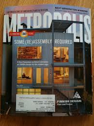
Metropolis Magazine interview with Wim Crouwel
Wim Crouwel is one of those hardy souls seemingly immune to self-doubt. That’s easy enough now, with Crouwel’s place as one of graphic design’s most influential practitioners secure. But his groundbreaking work has not always been universally admired, and in…
San Francisco Chronicle: John Patrick McKenzie exhibit / They Are Full of Holy Nonsense
“Sexy people are apple pies.” “One, two, tin …” “Acne, pimp, jerk…” The unlikely grouping and categorizing of words, phrases and numbers in the new exhibition “They Are Full of Holy Nonsense” at SF’s Creativity Explored range from the whimsical to…
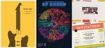
Print Magazine: Posters of Fortune / Typography Poster Show
Cracking open a fortune cookie at the end of a Chinese meal and seeing if/how the inside message personally relates to our individual lives is all part of the fun and good times. But the fact is, we all know…
Print Magazine: Getting Upper / Graffiti Meets Graphic Design
From the time we’re born until the day we die, the twenty-six letters of the alphabet are completely and totally unavoidable. Thus, one has to wonder—will there ever come a day when seeing our own language drives us all completely…

HowDesign Magazine: Hardest Workin’ Graphic Designers in the Midwest / Foundry Collective
Downing tequlia shots, ogling over Mila Kunis, and wanting to be the next Mark Zukerberg – just a few of the things on the mind of a twenty-something guy. But the bygone days of the industrial revolution? Probably not on…
Dwell Magazine: A Collection A Day Book
From delightfully mismatched buttons to colorful spools of thread to vintage typewriter ribbon, a variety of small, unexpected collections can be found in charming little tins. Thanks to artist/illustrator Lisa Congdon’s A Collection A Day blog project, we can now find…
SF Station: Tobias Wong ‘Bad Boy’ Designer at SFMOMA
Sometimes art speaks for itself and other times it needs explanation and context. The latter is the case for the work of the late artist-designer Tobias Wong, who takes the banally familiar and repurposes it into irony-laden statements about the…
Print Magazine: Why CMYBacon is Smokin’
With a name like CMYBacon how can you not be intrigued? Although Designer Martin Refsal has to “suppress my inner-geek from time to time to ensure that I don’t post too many things about Star Wars and Legos” he is the…
Print Magazine: Typography is HERE
“Widows and orphans give us sleepless nights.” In any other sense, that phrase might conjure up images of black spiders or a certain little redhead named Annie. But when you realize the words (about those annoyingly short words or lines at…
Print Magazine: Paper Theatrics / Alfalfa Studio
Alfalfa Studio could not have been cast more perfectly as the design studio of choice for innovative Texas-based theatre company Amphibian Stage Productions. Bringing the awesome three-dimensional quality of live theatre to the flat, two-dimensional space of poster design is no easy…
FastCompany: Chermayeff & Geismar on New NBC Universal Identity
Amid all the hue and cry over the new NBC Universal corporate logo, there are two voices actually worth listening to — those of Ivan Chermayeff and Tom Geismar, the designers of NBC’s beloved peacock. “I think the new one is…
Dwell Magazine: Matthew Carter Unveils New Typeface in San Francisco
Matthew Carter has a letter for web designers, typography geeks, and design buffs everywhere. Actually, he has a whole brand spankin’ new alphabet. On February 2nd, the iconic type designer unveiled his newest commercial typeface, Carter Sans, at the Book…
Print Magazine: Phonography and Why Graphic Designer Josh Higgins Rocks!
As a contributing writer for Print Magazine’s awesome design blog, Imprint, I recently had the fantastic opportunity to interview noted graphic designer and silkscreen artist, Josh Higgins. Josh conceived the unique idea for the phone-based photography exhibition, Phonography, featuring renowned creatives such…

FastCompany: The BIG Logo Controversy
Don’t mess with college football fans, their beer, their nachos or their…graphic design? There’s been big controversy buzzing on the web since Pentagram unveiled the redesign of the new Big Ten logo. To put it lightly, it was far from…
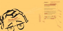
Woody Allen – Made from Type
Creative Madness is one of my all-time favorite typography projects. It was an exploration into the minds of some of the most noted creatives of our day: Zelda Fitzgerald, Woody Allen, Diane Arbus, Werner Herzog, etc. The book reinterprets their…
HowDesign Magazine: The Nightmare Client—YOU (or rather…me!)
Look in the mirror and say hello to the nightmare of all clients—Yourself. Why is it so hard for graphic designers to design for ourselves? In my latest article for HOW Magazine, I offer tips for taming the fire-breathing client within…
Smashing Magazine: Do you want fries with that logo?
From low-budgets to rush jobs to piss-poor project management, every designer has one time or another faced the inevitable, “I need a logo (brochure, website, etc.) done ASAP” scenario. Depending on the designers’ work situation, some can simply choose to…
