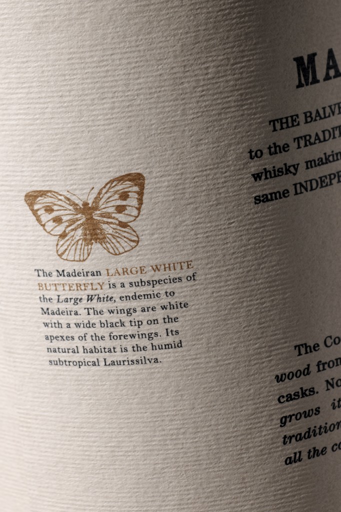
“Widows and orphans give us sleepless nights.” In any other sense, that phrase might conjure up images of black spiders or a certain little redhead named Annie. But when you realize the words (about those annoyingly short words or lines at the beginning or ends of paragraphs) were spoken by partner and typographer-extraordinaire Caz Hildebrand of London-based graphic design firm Here Design, the picture changes mighty fast. She adds, “All of us in the Here studio are unhealthily obsessed with the finer aspects of typesetting.” And man – does it show. Their attention to typography is spot-on awesome.
I was first introduced to Here Design’s work when I was in Barnes and Noble last fall and couldn’t take my eyes off the book, The Geometry of Pasta. But beyond designing cookbooks, Here Design’s work is an orgasmic feast for the obsessive-compulsive type geek in all of us.
Read my full article on Print Magazine’s design blog, IMPRINT.

