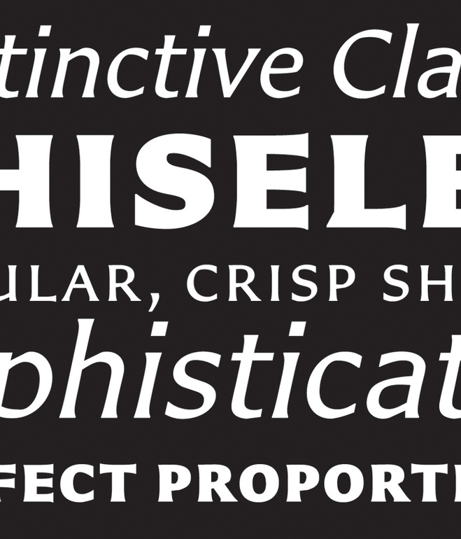
Matthew Carter has a letter for web designers, typography geeks, and design buffs everywhere. Actually, he has a whole brand spankin’ new alphabet. On February 2nd, the iconic type designer unveiled his newest commercial typeface, Carter Sans, at the Book Club of California in San Francisco to the delight of more than 80 graphic design glitterati. In a fireside-like chat with Editor/Designer Patrick Coyne of Communication Arts Magazine, Carter shared the behind-the-scenes story of his new typeface, his bemused thoughts on Ikea “scandalously” switching their catalog design from Futura to Verdana, and how the John Coltrane Quartet rocked his typographic youth.
Read my full article on DWELL.

